
Wizzle
Gamified gum packaging that brings together discovery, creativity, and play
Role:
Package Designer
Timeline:
Oct 2023 - Feb 2024
Overview:
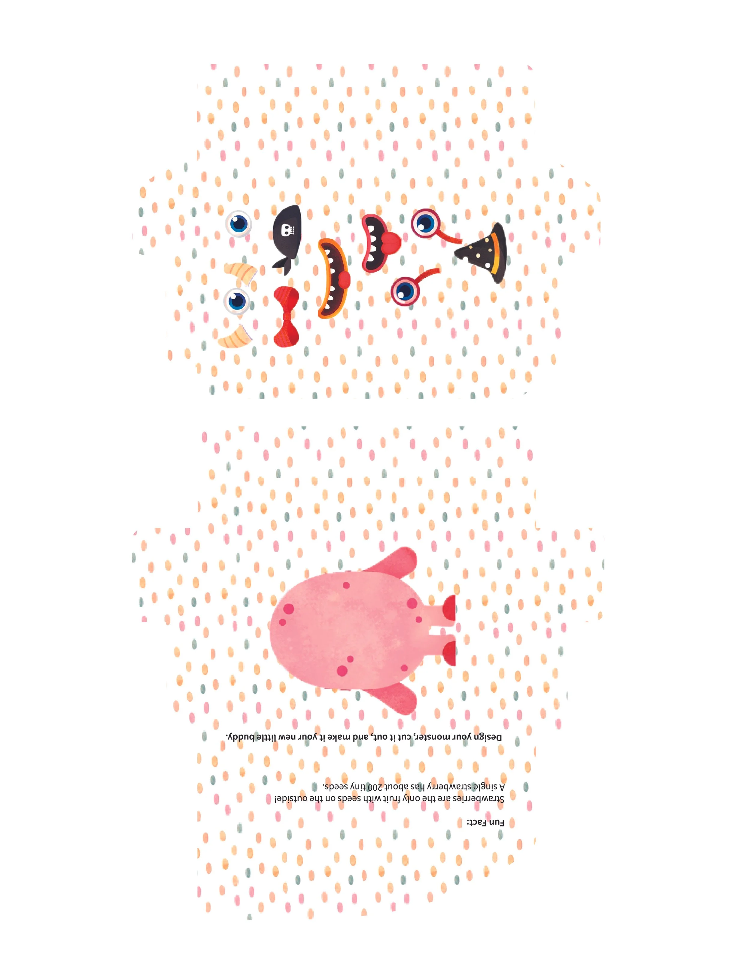
Wizzle is a gum packaging concept that transforms opening a pack into a playful, creative experience. Inside, users discover a monster character alongside illustrated eyes, mouths, and accessories they can combine to create their own little companion. The project explores how packaging can do more than contain and communicate a product. It can invite participation and become part of the experience itself.
Team:
1 Package Designer
Tools:
Adobe Illustrator
Adobe Photoshop
Category:
Packaging Design · Brand Identity · Physical Interaction · Prototyping
The Challenge:
The challenge was to integrate a creative activity into a compact package while maintaining its practical function. The design needed to hold the gum, communicate product information, and introduce the activity within a limited space. I approached the package as a sequence of interactions, considering what users see first, what they discover when they open it, and what they can do afterward.

The Concept
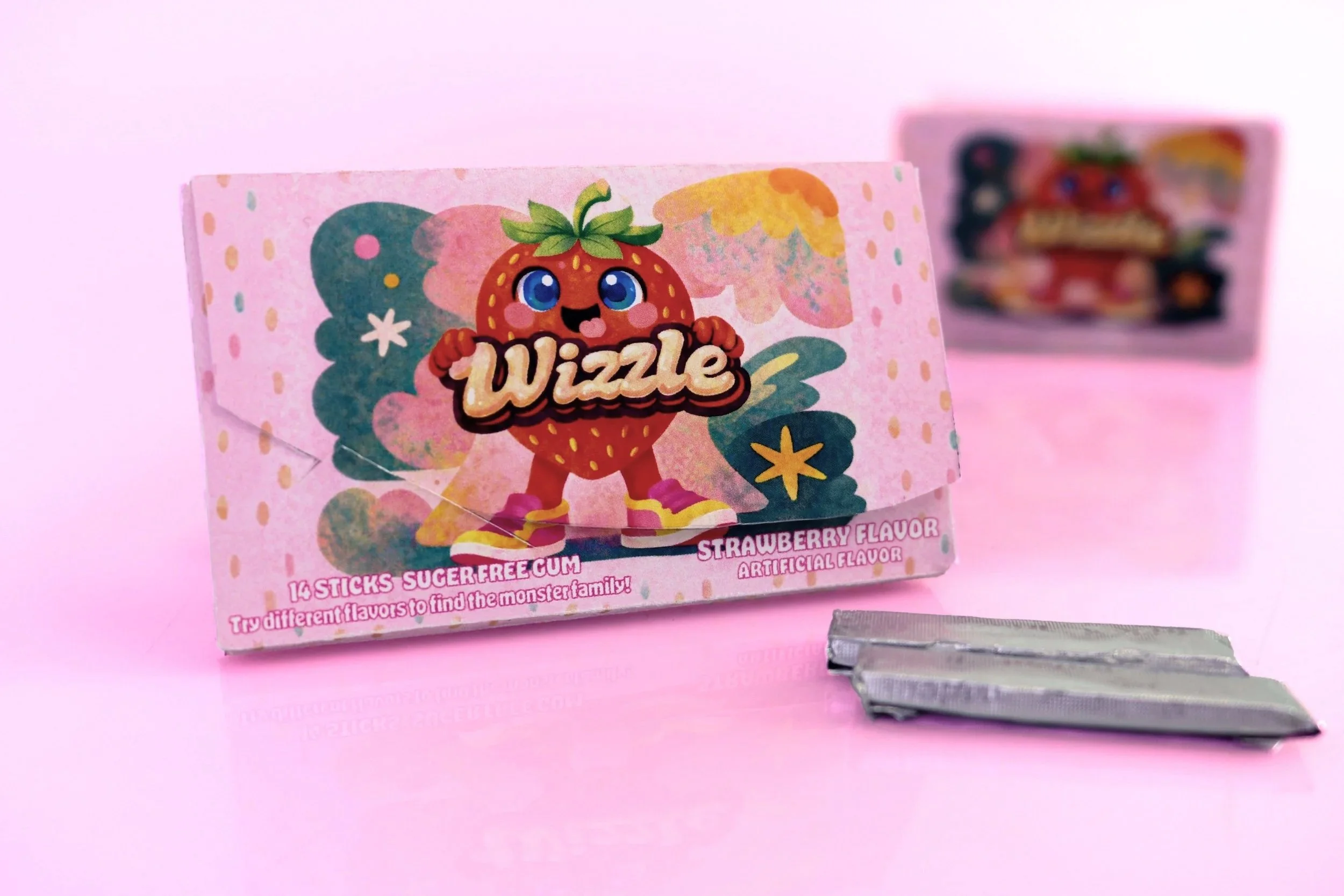
Wizzle’s concept centers on a family of colorful monsters. The exterior introduces the brand through a strawberry mascot, while the interior reveals a character users can personalize.
The playful experience is built around three ideas:
Discovery: Reveal the activity by opening the package.
Customization: Combine facial features and accessories to create a character.
Collection: Introduce a monster family that can extend across different flavors.
These elements connect the visual identity to an activity that gives users a role in shaping the experience.

How It Works
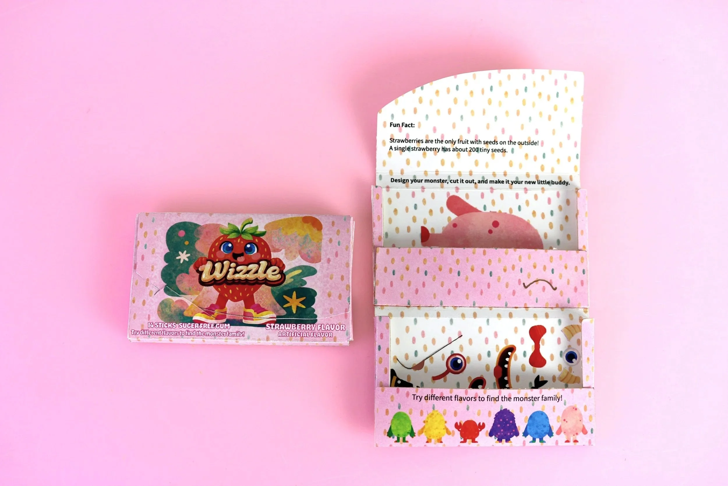
1. Open and discover
Opening the pack reveals the gum, a short flavor-related fun fact, and an invitation to design a monster.
2. Make it your own
Users choose from the illustrated eyes, mouths, and accessories to give their monster its own expression and personality.
3. Cut out and keep
The character can be cut out and kept as a small paper companion, giving part of the packaging a second purpose.

Visual Identity
The visual identity carries the same playful personality across the exterior and interior.
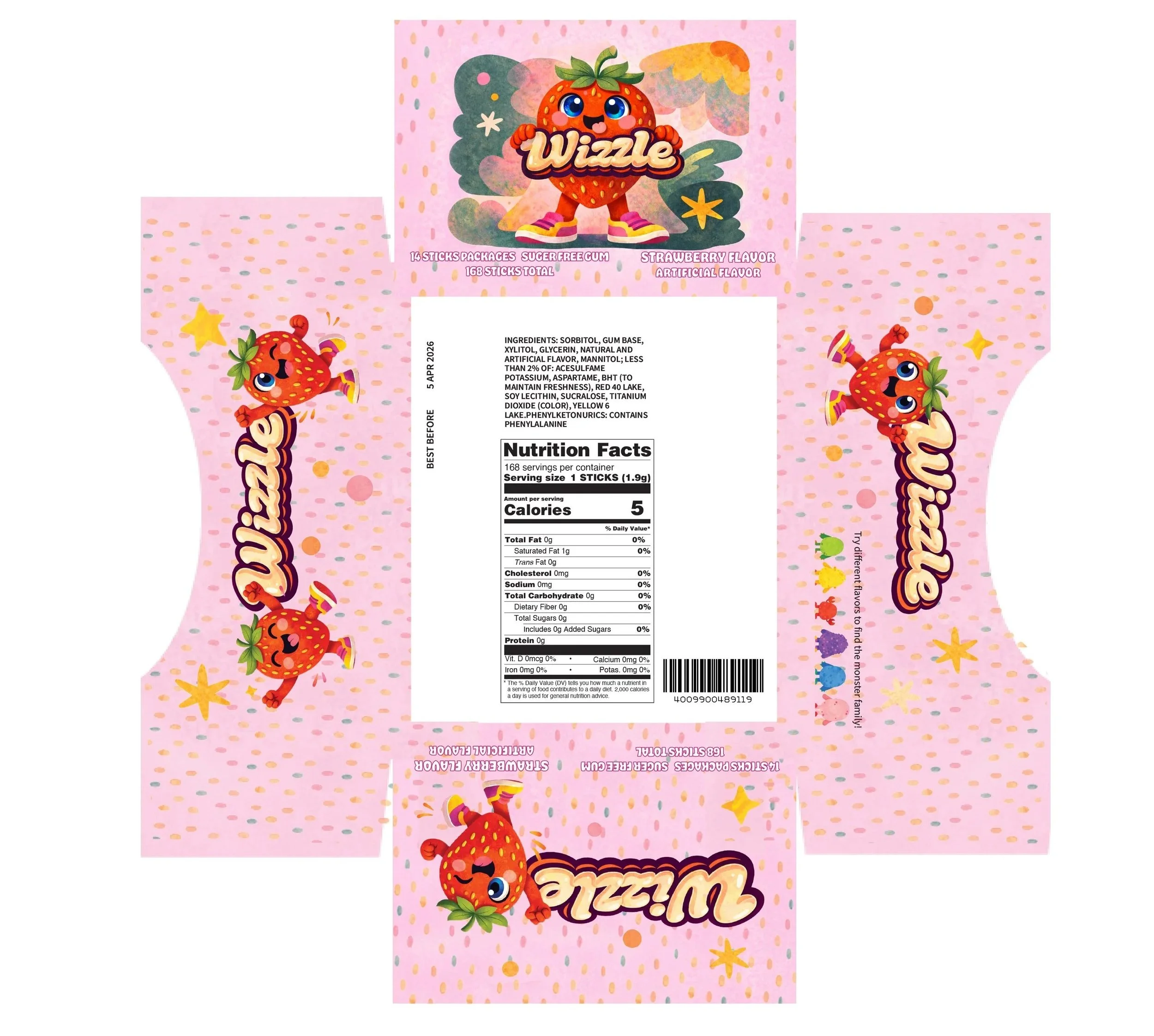
A strawberry mascot makes the featured flavor immediately recognizable. Rounded lettering, expressive faces, and bright accents create an energetic character, while the pink background connects the different packaging surfaces.
Textured illustrations and a repeating dot pattern bring consistency to the design. Inside, the monster body and separate features turn that visual language into something users can interact with.
The wider monster family establishes a foundation for future flavor variations, with different colors and character shapes belonging to the same brand world.

Packaging Structure and Prototype
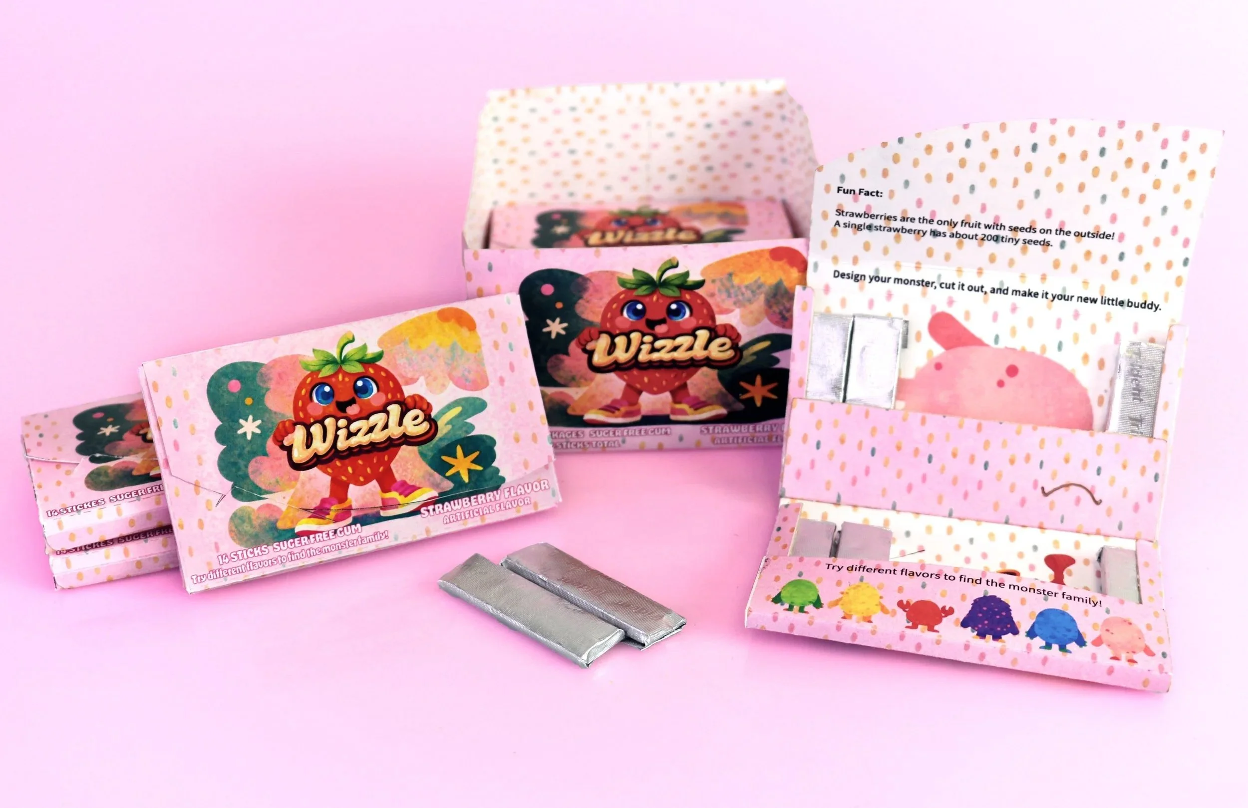
The packaging system includes an individual gum pack and a larger display box. Both use consistent colors, patterns, and character graphics to connect the product experience with its presentation.
Within the individual pack, folded sections organize the gum sticks while the interior surfaces carry the creative activity. This makes the placement of graphics part of the interaction: some elements introduce the product, while others appear as the package unfolds.
I developed flat print layouts and assembled physical prototypes to bring the structure and graphics together. The finished prototypes show how the illustrations, folds, and interior activity work across a three-dimensional object.
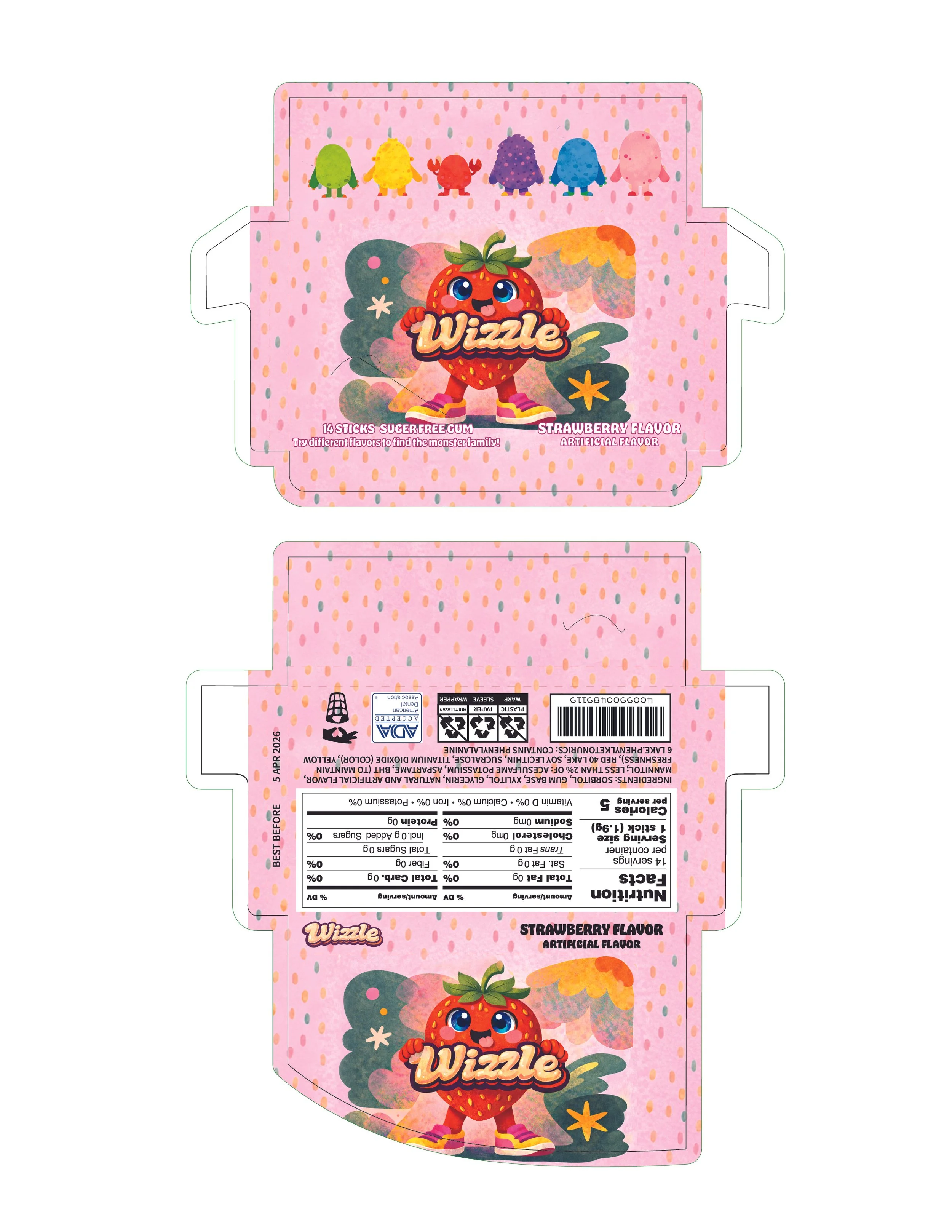
The final concept brings brand identity and physical interaction into one packaging system. Wizzle offers a clear progression from recognizing the product to discovering an activity and creating a personalized character.
The project demonstrates how a small, everyday object can become an opportunity for creative participation.

Outcome
What I Learned
Design the opening experience alongside the graphics.
Balance playful details with clear instructions.
Use package surfaces as opportunities for interaction.
Build consistency across individual and display packaging.